PulsePark
A mobile UX/product design concept for PulsePark, a parking-to-gate companion that helps event attendees reserve parking, plan arrival, coordinate with their group, walk to the gate, and find their car after the event.
The Event-Day Parking Problem
Large event parking can quickly become stressful. Drivers are often trying to compare lots, understand walking distance, meet up with their group, and remember where they parked, all while dealing with traffic, crowds, and time pressure.
The problem I focused on was not just “finding parking.” It was the full arrival experience. A better product needed to support the entire journey from parking decision to gate arrival to post-event car retrieval.
- Parking apps usually stop at booking, but the event-day journey keeps going.
- Users have to compare price, distance, walking time, and lot quality too quickly.
- It is hard to know which parking lot is the best choice under time pressure.
- Event traffic, crowds, and unclear directions make arrival feel stressful.
- Groups often arrive separately and lose track of who has parked or reached the gate.
- Users may need to switch between parking apps, maps, texts, and tickets.
- Walking directions from the lot to the correct gate are not always clear.
- After the event, users can forget where they parked, especially at night or in crowded lots.
Project Goals and Direction
The goal was to design a mobile experience that helps users make confident parking decisions and stay oriented throughout the event-day journey.
I wanted PulsePark to answer the questions users actually have on event day: Where should I park? How long will it take to get to the gate? Where is my group? Am I on time? How do I get back to my car?
Reduce decision fatigue
Recommend the best parking option based on walk time, gate access, price, accessibility, lighting, and exit speed.
Build arrival confidence
Turn a parking reservation into a timed arrival plan with a leave-by time, current step, and clear next action.
Support group coordination
Show who has arrived, who is on the way, and where the group should meet.
Close the loop
Save the car location, landmark, photo, walking route, and exit assist details for after the event.
Target Users Summary
PulsePark is designed for event attendees who drive to stadiums, concerts, festivals, and large venues.
The main user is someone who wants less uncertainty before arriving. They care about parking cost, walking distance, time to gate, group coordination, and getting back to the car safely after the event.
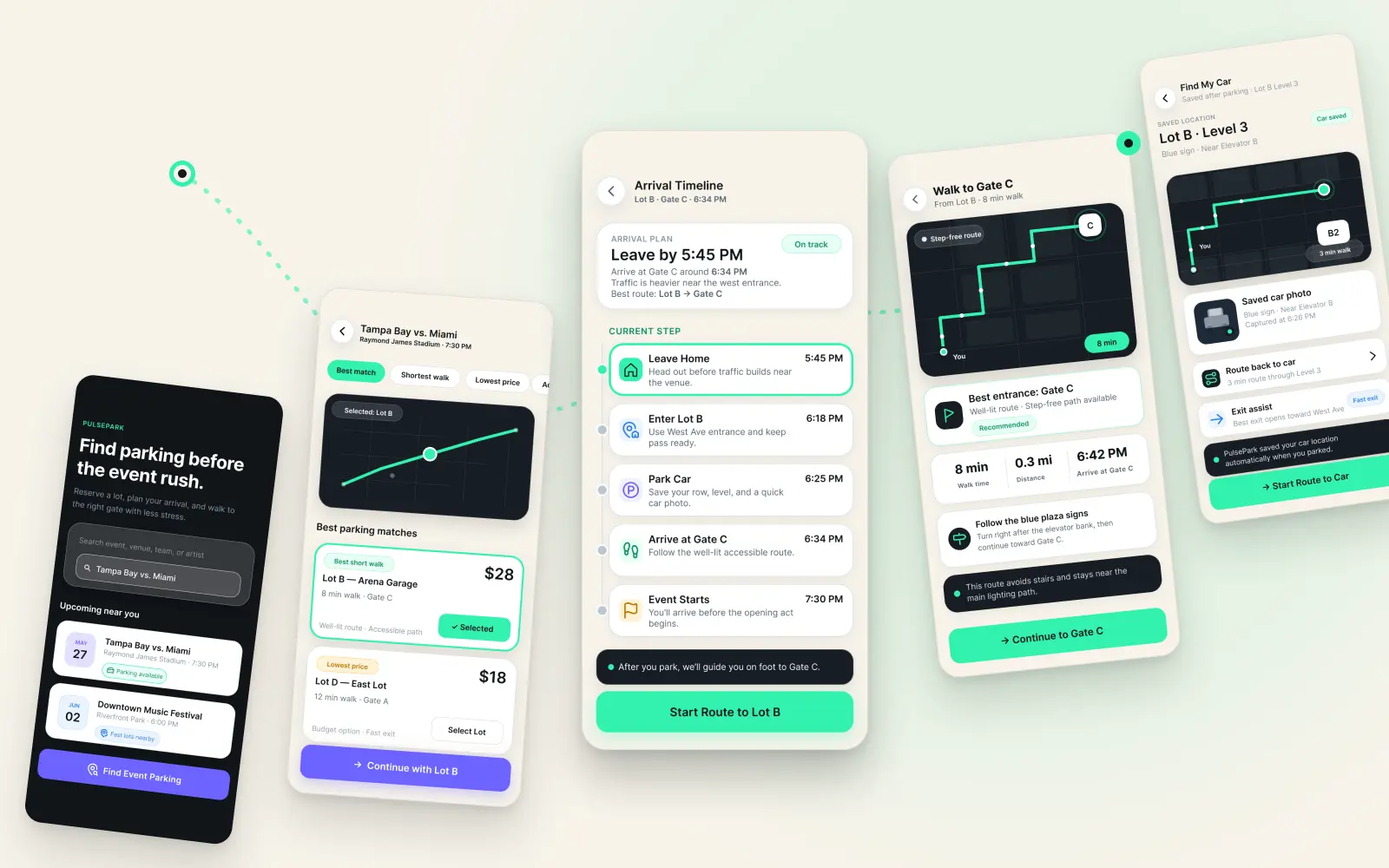
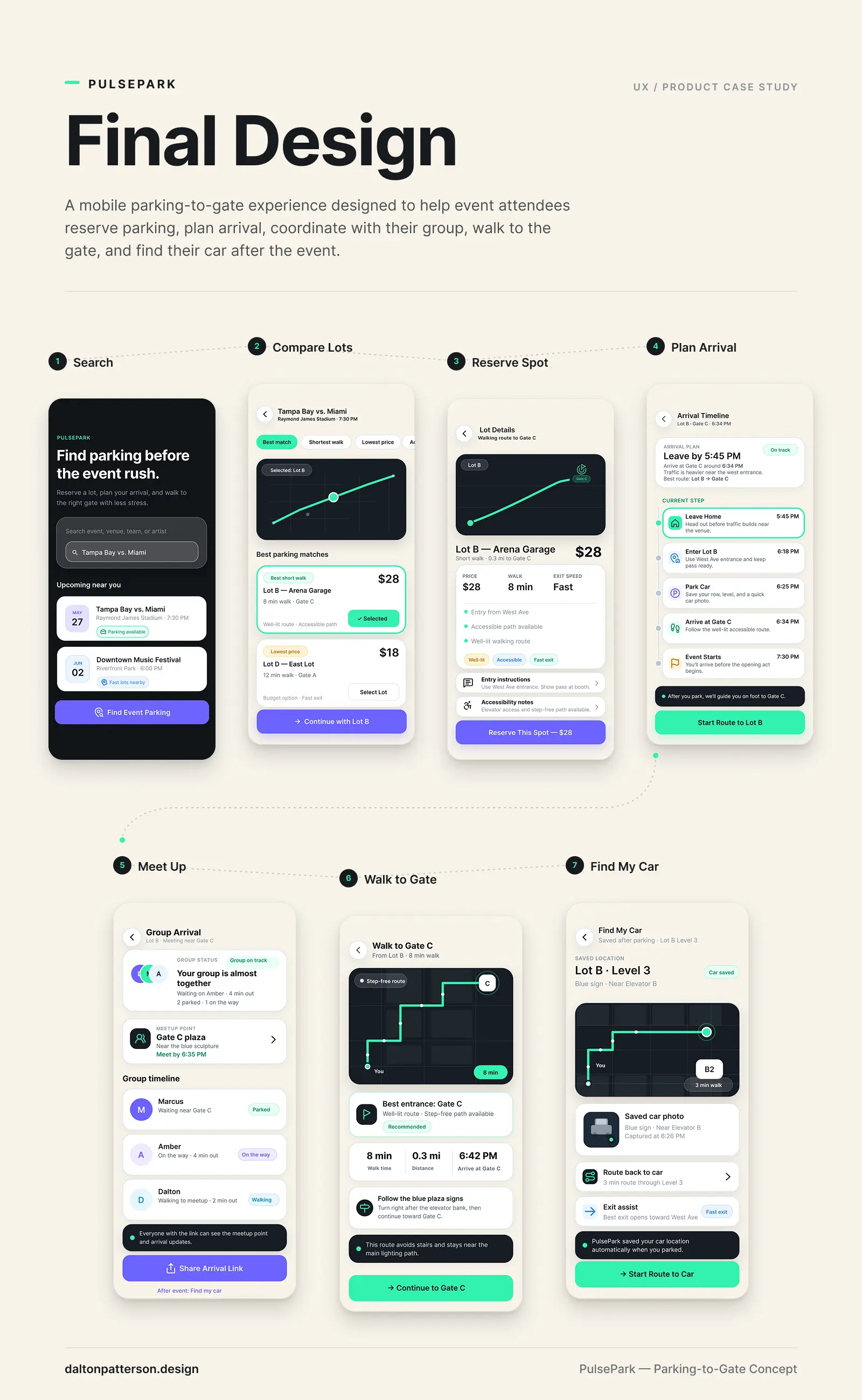
The flow answers questions in the order users naturally ask them.
The core flow starts with event search and moves through parking selection, lot details, reservation, arrival planning, group coordination, walking directions, and car retrieval.
I designed the flow to feel step-by-step instead of overwhelming. Each screen supports the next decision the user needs to make, instead of showing every possible feature at once.
- Search for event
- Compare available parking lots
- Review lot details
- Reserve parking
- Track arrival timeline
- Coordinate group arrival
- Walk to the gate
- Find the car after the event
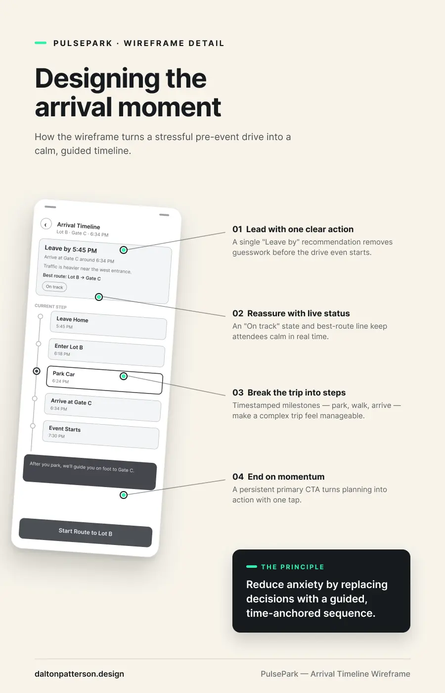
Wireframes and Flow Planning
The wireframes helped me focus on structure before visual design. I used them to test the screen order, information hierarchy, and what each screen needed to accomplish.
The main goal was to keep the experience clear on mobile: strong primary actions, simple cards, obvious route information, and helpful status updates during the arrival journey.
.webp)
Key Design Decisions
Recommendation before comparison
The parking results screen highlights Lot B as the best match so users do not have to compare every detail manually.
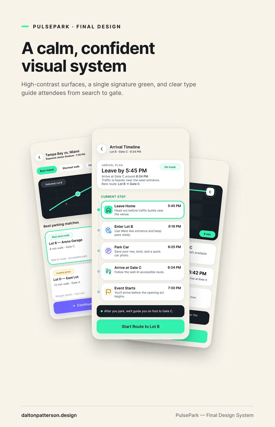
Timed arrival guidance
The arrival timeline gives users a leave-by time, current step, and gate arrival estimate to reduce uncertainty.
Shared group visibility
The group arrival screen shows who is parked, who is on the way, and where everyone should meet.
Step-free wayfinding
The walk-to-gate screen prioritizes clear route labels, step-free paths, well-lit route notes, and quick-glance walking stats.
Saved car return flow
The find-my-car screen saves the lot, level, landmark, photo, and return route to close the event journey.
CTA color logic
Purple CTAs are used for planning, booking, reserving, and sharing. Green CTAs are used for live navigation and movement.
Visual design system
The visual style uses a dark mobile interface with high-contrast cards, clear typography, and accent colors for important actions and status moments.
I wanted the design to feel modern and event-focused without becoming flashy. The system uses strong spacing, rounded cards, simple icons, and clear button hierarchy so the product feels easy to use in a busy environment.
Primary font: Inter
Use case: Clean mobile UI typography, readable labels, strong hierarchy, and simple product storytelling.
PulsePark: A mobile parking-to-gate experience for event attendees
PulsePark is a mobile app concept designed around one simple event-day problem: parking is only the first step. People still need to know where to go, how long it will take, where their group is, and how to find the car when the event is over.
For this project, I designed a full mobile flow that takes the user from event search to parking reservation, arrival timeline, group coordination, walking directions, and car location.
Project Outcome and Learnings.
This project helped me practice designing a product experience from end to end. I moved from problem definition to user flow, wireframes, visual design, and final portfolio storytelling.
The biggest outcome was learning how to design around the full user journey instead of a single screen. PulsePark gave me a way to show product thinking, UX structure, mobile interface design, and realistic design decisions in one complete case study.
- Created a full mobile app concept from problem to final UI.
- Designed a complete parking-to-gate-to-car user journey.
- Built a clear screen flow that supports real event-day decisions.
- Practiced mobile UI hierarchy, wayfinding, and product storytelling.
What I would improve next
If I continued this project, I would test the flow with event attendees and look for moments where the app could feel even faster or simpler. I would also explore live traffic data, venue-specific gate information, accessibility routes, and better group location privacy controls.
I would also refine the prototype with more real-world edge cases, like delayed arrivals, full lots, poor signal near venues, and users splitting up from their group.
Need a UX Designer who can turn complex ideas into clear, usable product experiences?
I’m open to UX Designer, Product Designer, and UI/UX Designer roles where I can help teams organize complex ideas, improve user flows, create wireframes, and design digital experiences that are easier to understand and use.