.webp)
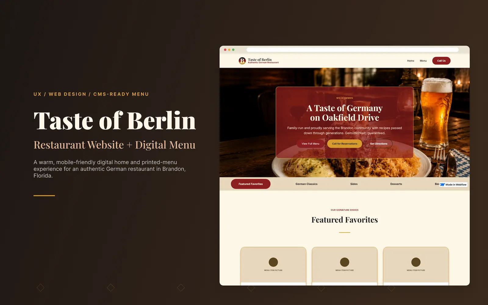
Taste of Berlin
A concept website for a neighborhood German restaurant, built around one question: can a menu feel like a real printed German menu and still be fast, readable, and easy to use on a phone?
Most restaurant sites make the menu the hardest thing to use
A lot of restaurant websites lean on big hero photos, busy layouts, or a PDF menu that was never meant for a phone. The food looks great, but the actual decision gets buried. For Taste of Berlin, I wanted the opposite: a site that feels warm and authentically German, but where the most important actions stay effortless.
- Visitors need to understand the restaurant quickly without reading too much.
- Menu items need to feel organized and easy to scan on mobile.
- The visual design needs to feel authentic without becoming too heavy or outdated.
- Calls to action should be clear without making the site feel overly salesy.
- The menu page needs to work now with static content and later support CMS items.
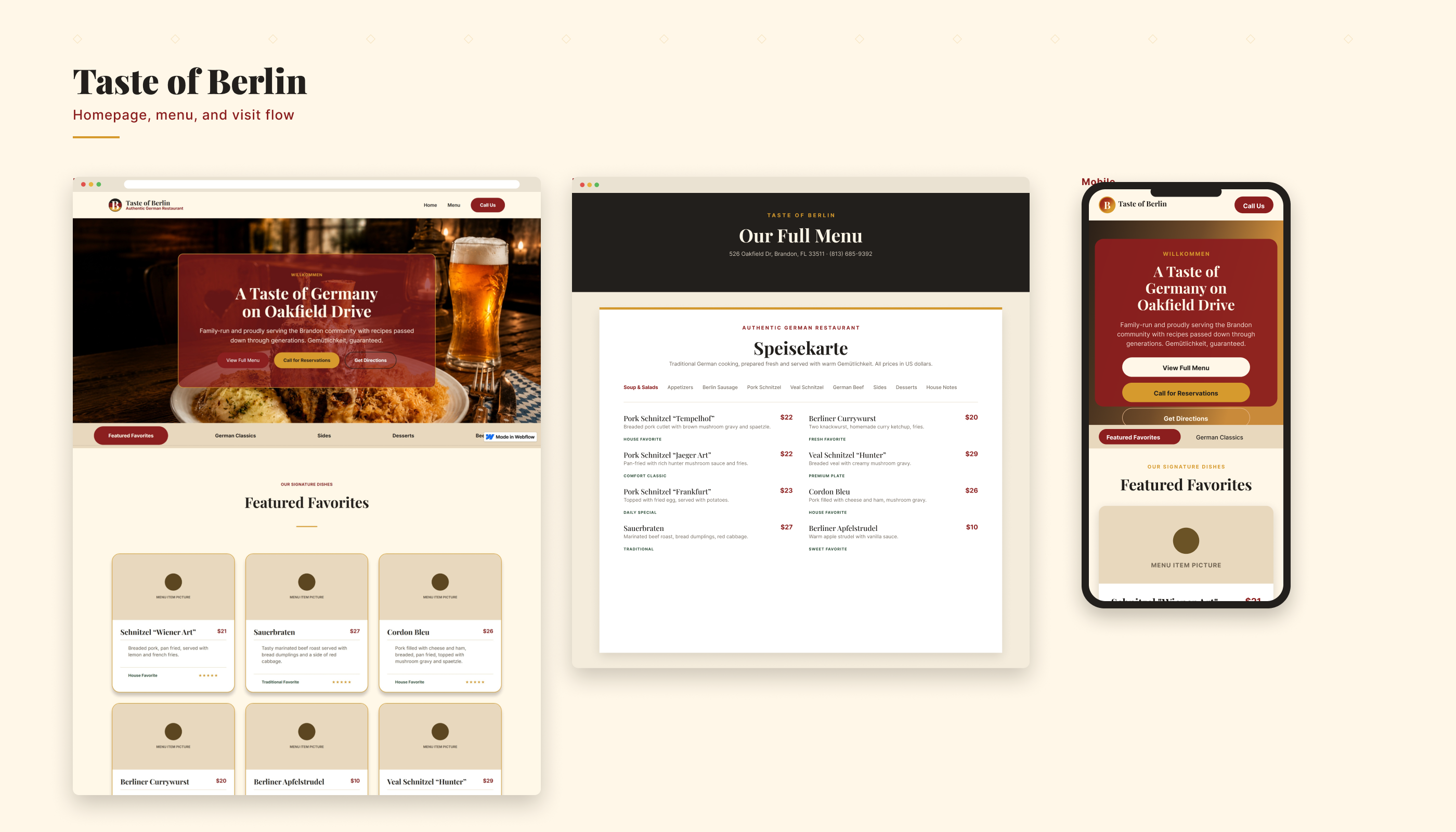
Treat the menu as the core UX, not a decorated list
The goal was to design a digital experience that felt warm, familiar, and easy to navigate. Instead of treating the menu as a basic list, I approached it like a key UX feature: grouped categories, clear hierarchy, readable descriptions, and a layout that could eventually scale into Webflow CMS.
Make the menu easy to scan
Group dishes into clear categories with readable descriptions so visitors can browse without effort.
Build trust and atmosphere
Use a warm, German-inspired visual style that feels authentic, local, and memorable.
Support fast decisions
Help visitors quickly decide whether to visit, call, order, or get directions.
Plan for scale
Structure the menu so it can grow from static content into a Webflow CMS system.
Target Users Summary
Taste of Berlin is designed for local diners, families, and lunch visitors, as well as people searching nearby for authentic German food. These users arrive with quick goals: view the menu, understand the food, check the location, and decide whether the restaurant feels worth a visit. They care most about clarity, atmosphere, and being able to take the next step easily on mobile.
The flow answers questions in the order users naturally ask them.
The experience moves visitors from a warm first impression to a confident decision. Users land on the homepage, quickly understand what the restaurant is and where it is, browse the menu by category, build trust through atmosphere and clear information, and then take a real-world action like visiting, calling, ordering, or getting directions. Each step is designed to reduce friction and keep the most important next action within easy reach, especially on mobile.
- Land on the homepage
- Understand the restaurant and location
- Browse the menu by category
- Build trust through atmosphere and clear information
- Take action: visit, call, order, or get directions
Every choice traces back to clarity, trust, or mobile usability
Warm visual system
I used a cream background, deep red, charcoal, gold, and green to give the site a cozy German restaurant feel while keeping the text easy to read.
Printed-menu-inspired layout
The menu uses clear categories and type-led item rows instead of image-heavy cards. This makes it faster to scan on mobile and gives the page a printed-menu feel.
Mobile-first navigation
The menu tabs stay simple so users can switch categories quickly without losing their place.
CMS-ready structure
Each menu item is designed to map cleanly to CMS fields like name, description, price, category, and featured status.
Conversion-focused CTAs
Buttons guide users toward the next real action: viewing the menu, getting directions, calling, or planning a visit.
A small, warm system that stays consistent and scales
The visual system was created to feel rich, cozy, and approachable. The cream background gives the site a softer restaurant feel, while deep red and charcoal help anchor important content. Gold adds warmth and emphasis, while green supports a grounded, traditional food atmosphere.
Headings use Playfair Display (or a similar editorial serif) for warmth and restaurant character, while body text uses Inter (or a similar clean sans serif) for readability, especially on menu descriptions and mobile content. The pairing keeps the experience feeling editorial and inviting while staying clear and easy to scan.
A site that helps people understand the place and act on it
The final direction brings together a warm homepage, strong restaurant positioning, a printed-menu-inspired menu page, responsive navigation, and reusable global styles. The experience is designed to help visitors quickly understand the restaurant, browse the food, and take action without getting lost in the layout.
.png)
What this project demonstrates
As a concept, Taste of Berlin isn't about traffic or sales numbers, it's about showing how I think. It demonstrates UX reasoning across user intent, content structure, and real-world conversion, not just a nice-looking page. Specifically, it shows I can:
- Translate a brand into an interface, turning "authentic neighborhood German restaurant" into concrete type, color, and layout decisions.
- Design content hierarchy, structuring a menu so it's scannable and meaningful, not just styled.
- Design for mobile-first, responsive reality.
- Plan for scale, so the menu can grow into a Webflow CMS.
- Think in systems, with reusable styles and components that stay consistent.
Where I’d take it next
The next step would be to turn the static menu into a full CMS-powered system with categories, item tags, pricing, featured dishes, and availability controls. I would also add local SEO content, structured data, analytics events, and conversion tracking for calls, directions, and menu interactions.
- Connect menu items to Webflow CMS.
- Add restaurant schema markup for local SEO.
- Track clicks on call, directions, and menu categories.
- Add featured dishes or seasonal specials.
- Test the mobile menu experience with real users.
- Compress and optimize all food and hero images.
Need a UX Designer who can turn complex ideas into clear, usable product experiences?
I’m open to UX Designer, Product Designer, and UI/UX Designer roles where I can help teams organize complex ideas, improve user flows, create wireframes, and design digital experiences that are easier to understand and use.